Selected case study
MASTER'S WORK · Politecnico di Milano
Feelink
- Timeline
- 8 Weeks · 2019
- Role
- Interaction Designer · Researcher
- Scope
- Context research · Concept development · Interaction design · Prototyping · User testing
Feelink was developed as part of a university brief around the humanisation of out-of-home advertising assets for IGP Decaux.
Instead of treating advertising as something people simply looked at while waiting, we explored whether the advertising surface could become an interaction between people — giving brands a way to remain part of the experience while creating a small moment of connection between strangers.
As part of the group, I worked across contextual research, problem framing, concept development, interaction design, gesture prototyping and final validation. I led the user-testing activity during the final demo, including observation, video analysis and post-test interviews.
Understanding the Waiting Experience
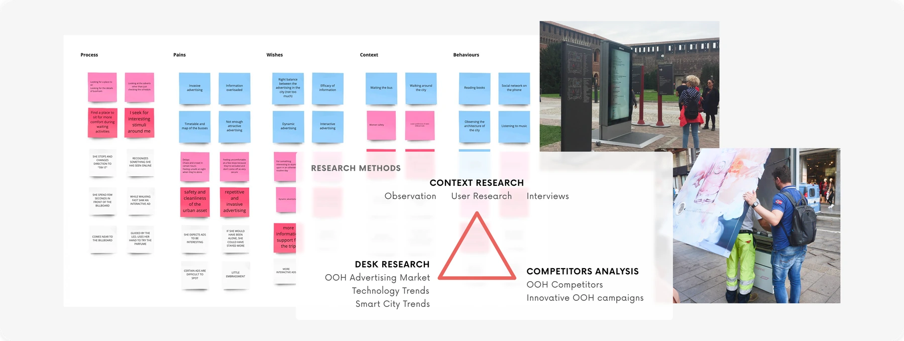
We began by observing people in public waiting environments and speaking to them about what caught their attention, what they did while waiting and how they interacted with advertising around them.
Alongside the field research, we looked at OOH competitors, smart-city and technology trends, and existing interactive advertising campaigns.
Finding the Opportunity
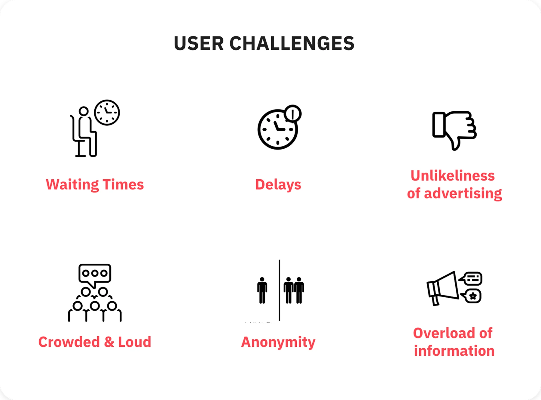
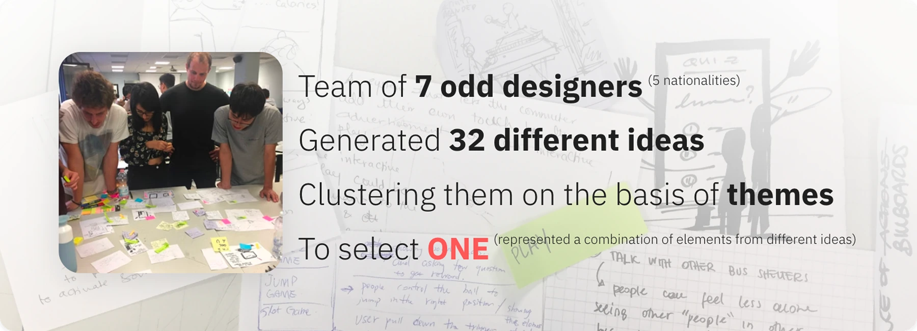
Clustering the research surfaced a mix of practical and emotional challenges around waiting — from delays, crowded environments and information overload to boredom, annoyance and anonymity.
We generated several How Might We questions from these findings and chose one direction that brought the strongest themes together:
How might we create a way to reduce boredom during waiting time?
This gave us room to explore something short, playful and easy to understand in a public setting.
Choosing a Shared Metaphor
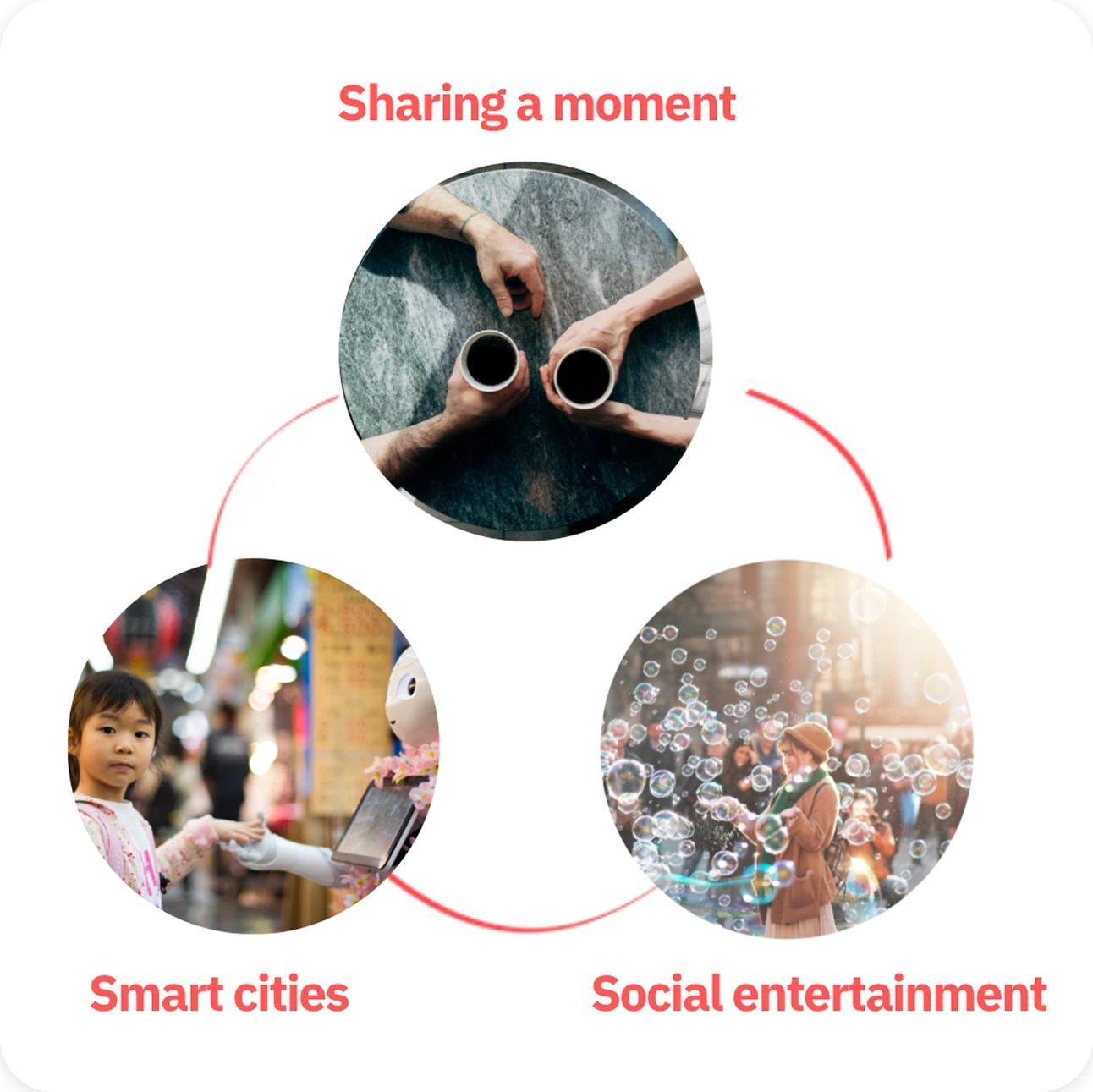
We explored different ideas around social entertainment, smart cities and sharing a moment before narrowing the concept.


The paper plane became the central metaphor because it was familiar, playful and naturally communicated the idea of sending something from one person to another.
We chose gesture interaction so people could participate without touching the screen. The prototype used Kinect for body tracking, silhouette generation and gesture recognition, with Unity as the development environment.
Making Gestures Understandable
Gesture interaction required more iteration than the concept itself.


We tested several movements through low-fidelity prototypes to find gestures people could understand and execute with minimal instruction. This resulted in our own gesture kit for the final experience.
The challenge was balancing a movement that felt expressive enough to be playful with one that was simple enough to learn quickly in public.
Gesture Kit
Bringing the Interaction Together

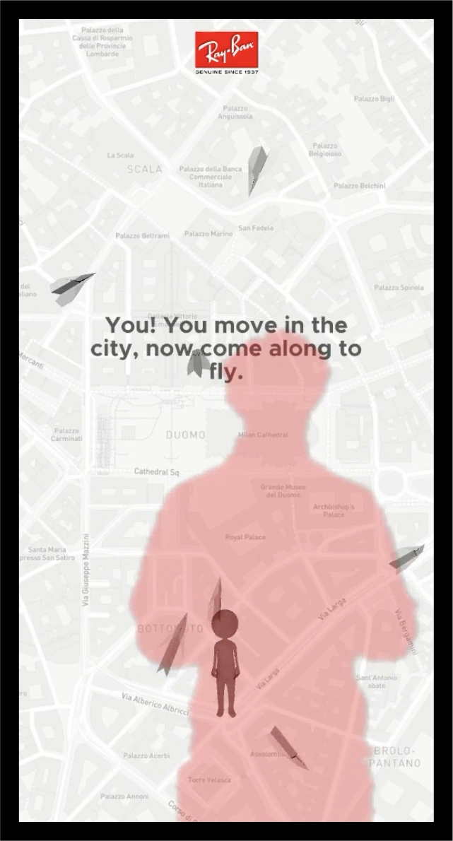
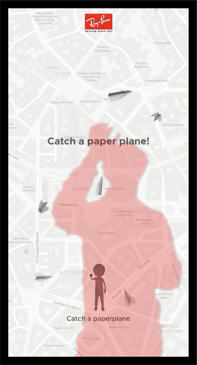
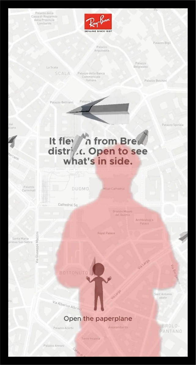
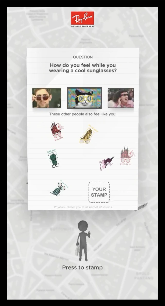
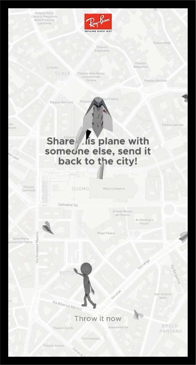
The final experience used looping paper planes to attract attention, a body silhouette to trigger participation, and on-screen prompts and gesture animations to guide people through the interaction.
What Happened When People Tried It?

We documented around 28 people testing the final demo.
Among them:
- 100% preferred interactive advertising over static advertising,
- 78% preferred gesture interaction over touch,
- 64% had difficulty executing some of the gestures.
That last result became the most useful. The problems came from both technical lag in gesture recognition and the layout of the instructions. The interaction concept was engaging, but parts of its execution still needed to become easier to understand.
What I Learnt From Testing
One of the most useful lessons was learning when to help a participant and when to stay quiet.
Some people moved through the interaction without help. Others needed small hints. Those moments became useful evidence because they showed where the experience itself was not communicating clearly enough.
Testing helped us separate problems in the concept from problems in the instructions and technical implementation.
What changed after testing
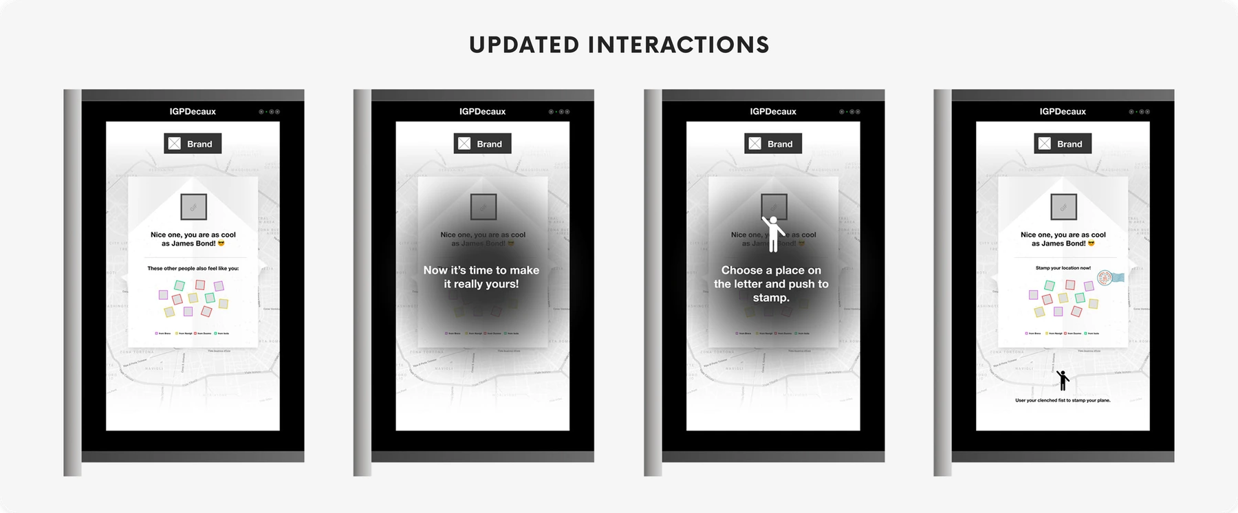
Based on the testing, we made the instructions easier to follow by keeping them within the user’s line of sight, reducing the need to re-orient their body, and clarifying what the response stamps represented.